
Good Morning crafters!
I hope you are having a great day, mine has started so good even though it is not weekend day hehe But I happy to be here to show you such a special project to me. Besides, I had so much fun creating it and I couldn't wait to post it.
Today I wanted to show you my first approach with Project Life pages. I was so curious about all the excitement around this kind of Life Documenting that I just had to give it a try. But as you may have already discovered, it is hard for me to keep up to date with documenting my life, because some weeks I have plenty of time to take photos or make crafts but others I struggle to make just a single page. However, I promise I am really trying to make a couple of projects a week, at the very least. By the way, I always have so much fun making cute things!!!

So, a few weeks ago I saw on Janna Werner's blog how to create a fake project life spread (find it here). And I thought this could be just the perfect way to try this technique without having to buy special page pocket protectors and it would go perfect on my Layout albums, as a different sketch page.
So, what exactly is fake about this page? It seems as if this was a normal PL page protector with several pockets. But, it aint – it’s a complete layout with a 12″ x 12″ white cardstock base. I used my sewing machine to create fake pockets: ten at 3″ x 4″ and one at 6″ x 4″. - "Janna Werner"
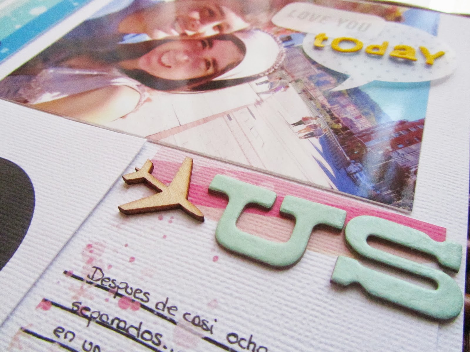
 The pics I chose are from a very special day a couple of weeks ago: my boyfriend finally came to Bilbao after months of only Skyping, FB messages and so on. Therefore there were a lot of little moments from that day that I want to immortalize.
About the PL cards, I made them myself because I wanted to make it more personal... and I couldn't decide which commercial cards I wanted to incorporate anyways. I had so much fun creating these!!! I specially like the title card on the top left, it has so much colour and the digital stamp from Kalbateski, is just gorgeous. Have you seen it? Thanks to Studio Calico for their amazingly inspiring class: Toolbox! And specially to Shanna Noel, from whom I learnt so much on how to use Photoshop to design my own backgrounds, cards, embellishments, etc...

I decorated the cards, with some bits here and there to give them more dimension but at the same time, keeping them simple. For example: some new alphabets from the Thataway Collection, wood veneers, vellum speech-bubbles, enamel dots and some journaling stamps.

I have to say that this page came really easily together that I think now I kind of understand why people love PL so much. So what do you think? Am I a potential Project life documenter or not? and for those who have n0t tried a PL spread yet, this is the perfect way to give it a go, I promise!!

xoxo
Boo
Good Morning crafters!

 The pics I chose are from a very special day a couple of weeks ago: my boyfriend finally came to Bilbao after months of only Skyping, FB messages and so on. Therefore there were a lot of little moments from that day that I want to immortalize.
I decorated the cards, with some bits here and there to give them more dimension but at the same time, keeping them simple. For example: some new alphabets from the Thataway Collection, wood veneers, vellum speech-bubbles, enamel dots and some journaling stamps.
I have to say that this page came really easily together that I think now I kind of understand why people love PL so much. So what do you think? Am I a potential Project life documenter or not? and for those who have n0t tried a PL spread yet, this is the perfect way to give it a go, I promise!!


