
Hello,
Today I bring you a really short post but with a lots of photos. Here you can see 3 projects that I made with the Studio Calico March Scrapbooking kit "Office Hours". This month I didn't get any add-on as at the time of the reveal I still had the February Kit untouched. So, I didn't want to have more products that the ones I could use in a month.
When I saw the kit I got inspired by its color palette. So many cool colors! So I decided to focus on one color per page. Here you can find the three main colors that I found interesting to work with from the kit.
Yellow layout: RAD
That striped paper is pure love. So beautiful!! It really matched the navy blue rub-ons included in the kit. And what about the watercolor paper die-cuts? I wanted to painted them but in the end I added them in white as I already added to much color on the page. I also used some mint embellishments for this page to contrast the dark blue.


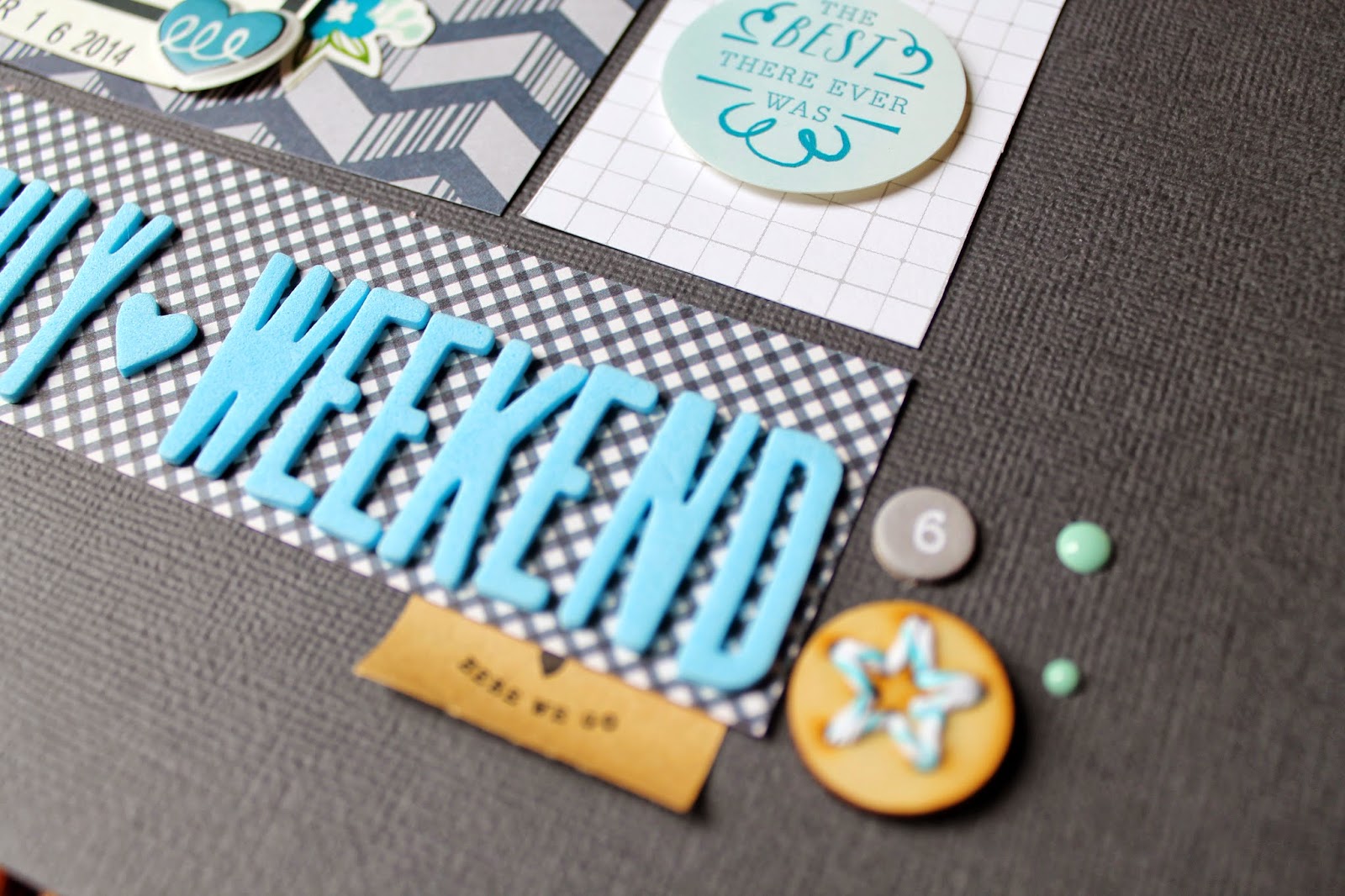
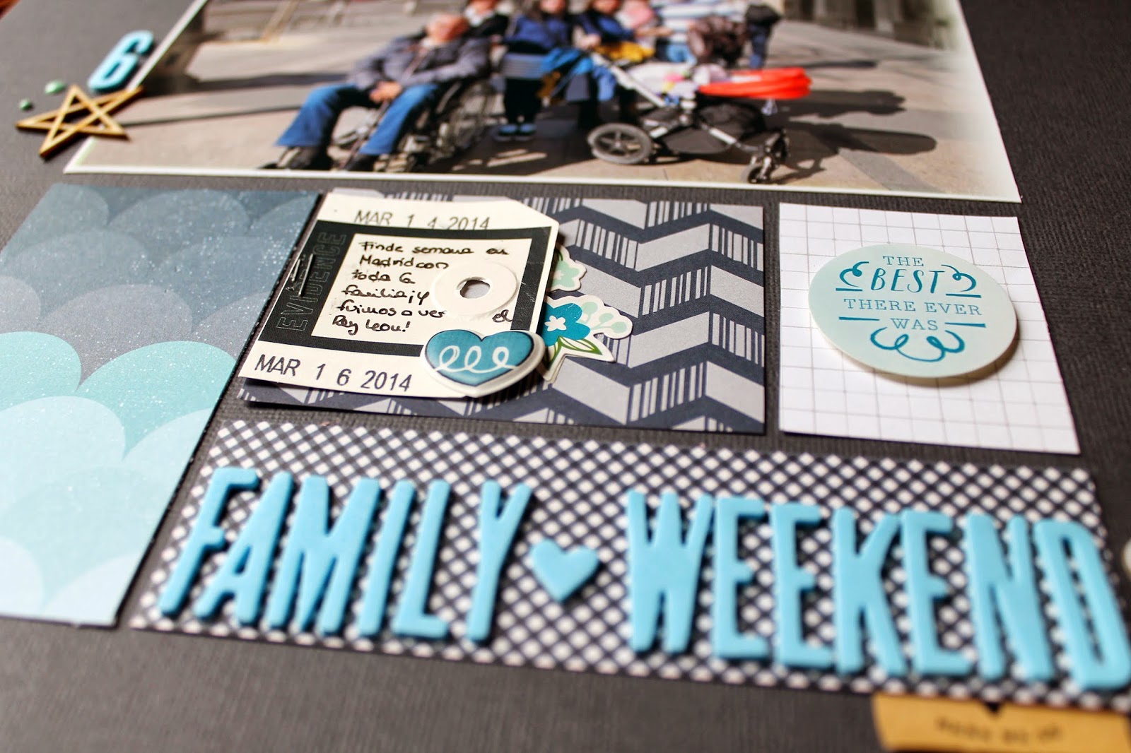
Blue layout: Family Weekend
I am starting to love to work with dark cardstock as the background. It really makes bright colors to pop out of the page, don't you think? This photo was perfect for this page as it has a lot of blues on it. I love using huge photos on my layouts too!


Red edition: almost March
I love this one!! So bright and with such a great feeling! This is my first time using the embossing technique and I couldn't be more happier with the result. I embossed the huge flower stamp included in the kit. It is a great way to add white stamping on a colored background as normally with a common white stamp pad you can't get such an opaque and bright result.


xoxo
Boo
//////////////////////////////////
Hola,
Hoy os traigo un breve post, pero con un montón de fotos. Podeís ver 3 proyectos que he hecho con el kit de Studio Calico de marzo de Scrapbooking " Office Hours" . Este mes no he cogido ningún add-on ya que en el momento de comprarlo todavía tenía el kit de febrero sin tocar. Por lo tanto, no quería tener más productos que los que yo podría utilizar en un mes.
Cuando vi el kit me inspiré en su paleta de colores. ¡Tantos colores tan vivos! Así que me decidí a centrarme en un color por página. Aquí podéis encontrar los tres colores principales que más me interesaron del kit.
Diseño amarillo: RAD
Ese papel de rayas es amor puro. ¡Tan bonito! Y lo bien que queda con los azules marinos de los rub-ons del kit. Y qué decir de los de papel de acuarela Troquelados. Tenía intención de pintarlos, pero al final les añadí en blanco ya que ya había añadido mucho color en la página. También usé algunos adornos de color turquesa para que contrastaran con el azul oscuro.
Diseño azul: Fin de Semana Familiar
Estoy empezando a cogerle el gusto a trabajar con cartulina oscuro como fondo. Realmente hace que los colores sobresalgan de la página, ¿no os parece? Esta foto ha resultado ser perfecta para esta página, ya que tiene un montón de azules distintos en ella. ¡Me encanta usar fotos gigantes también!
Edición Rojo: casi Marzo
¡Esta es mi favorita sin duda! Tan alegre y con una gran fuerza. Esta ha sido mi primera vez utilizando la técnica de embossing y no podría estar más feliz con el resultado. Le he dado relieve al enorme sello de la flor incluido en el kit . Sin duda es una gran manera de añadir estampado blanco sobre un fondo de color. Normalmente con un tampón de tinta blanca común no se puede conseguir un resultado tan opaco y brillante, asi que ya sabeis: para obtener algo así usad embossing.
¡Espero que os gusten estas páginas y divertíos scrapeando!
xoxo
Boo
No comments:
Post a Comment