Showing posts with label Project Life. Show all posts

Sep 8, 2014

Home (Glitz Design CT)

Hello,
Today I bring you the last page that I created for Glitz Design. You probably already noticed that this is not my typical 12x12 layout. Instead, I created a 8x6 layout for my Summer Handbook. I love playing with different sizes lately and this one is really one of my faves. I love how the embellishments look so much bigger in comparison as the smaller size of the page make them stand out so much more. Don't you think?


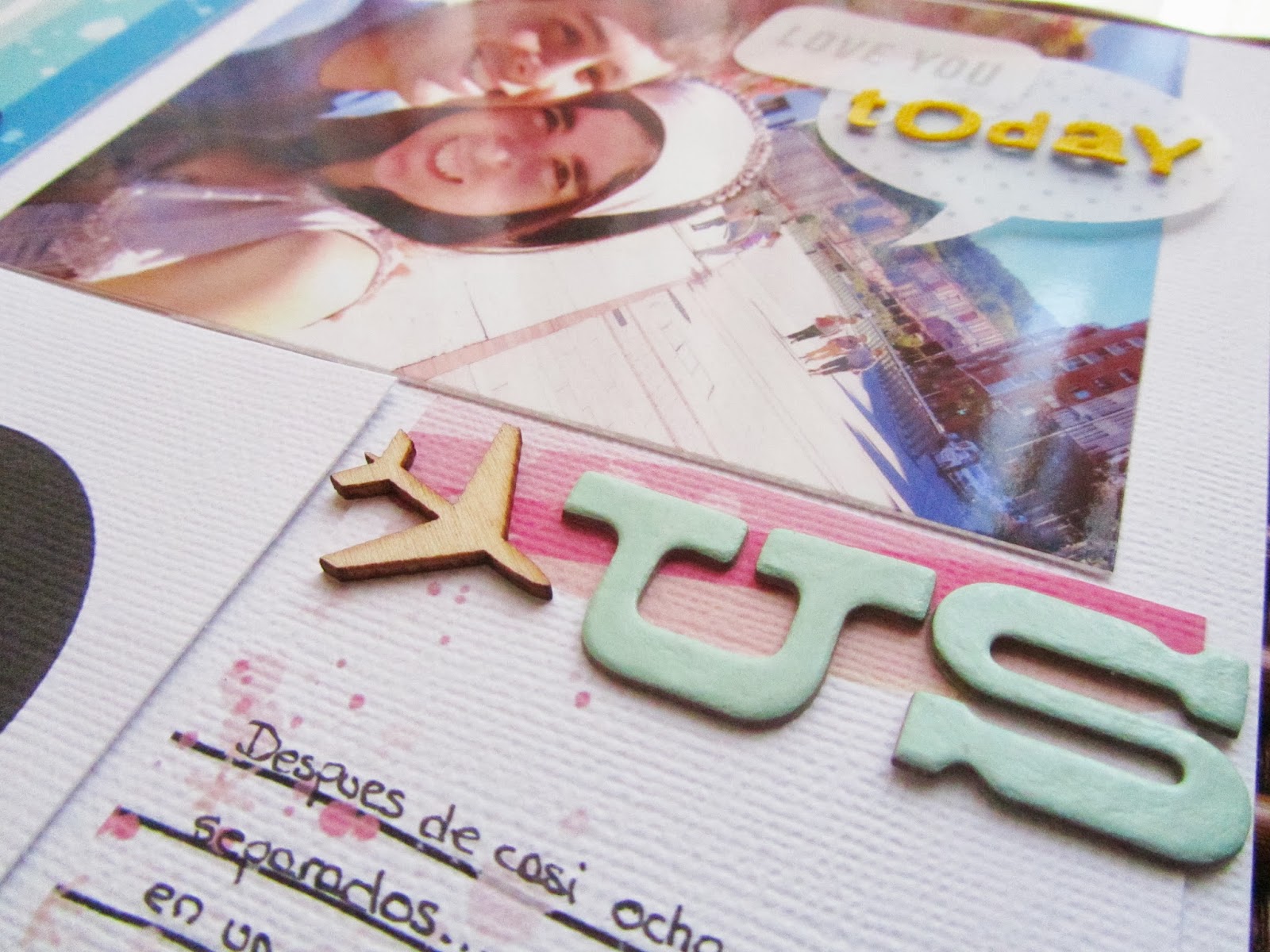
So, I decided to place my photo on the top part of the page and fill the bottom space with a bunch of cute embellishments. I pulled out embellishments with kind of the same color palette as the one in the photo to make everything coordinate. 


I also added some gold here and there which I have noticed that I tend to use a lot lately (more than what I should for sure) too. 


Finally, I added my title at the bottom of the page among the other embellishments. At first, I thought about adding it right on top of the photo to make it stand out a little bit more. But in the end I felt like I didn't need a super big title as the photo already pretty much reflected how I felt at that moment.  

xoxo
Boo
//////////////////////////

Hola, 
Hoy os traigo la última página que he creado para Glitz Design. Probablemente ya os habréis fijado que este no es la típica página 12x12 que suelo emplear. En lugar de eso, esta vez, he creado un diseño de 8x6 para mi álbum del verano. Ultimamente me ha dado por jugar con diferentes tamaños y este es realmente uno de mis favoritos. Me encanta cómo los adornos se ven mucho más grandes en comparación debido al menor tamaño de la página lo que hace que destaquen mucho más. ¿No creéis? 

Así que decidí poner mi foto en la parte superior de la página y llenar el espacio inferior con un montón de adornos super monos. Elegí adornos con la misma paleta de colores que aparece en la foto para que todo coordinase. 

También he añadido un poco de dorado oro y que me he dado cuenta de que suelo tender a usarlo mucho (más de lo que debiera seguro) últimamente. 

Por último, he añadido mi título en la parte inferior de la página entre los otros adornos. Al principio, pensé en añadirlo a la derecha en la parte inferior de la foto para destacarlo un poco más. Pero al final sentí que no necesitaba un gran título ya que la foto lo dice todo.  
xoxo 
Boo

Sep 4, 2014

Goslar (GlitzDesign CT)

Hello,
and welcome back for another Handbook spread created for Glitz Design. I am still finishing my album about this past summer although these pages may look a bit like a Fall spread due to the colors I chose and my clothes on the photos. Now I know that Summers in Germany could be quite short and you can not wait always for the perfect sunny day to travel around. Just get your jacket an umbrella and let's go!


I tried to keep a very soft palette with lots of shades of blue and white because I wanted to focus on the photos.  I also added some pop of orange to drive the attention on certain points.


It is a very simple spread with a lot of photos from our day trip to Goslar. And as I was running out of space to journal (due to the big sized photos I used), I added the "Take Note" sticker to have a little extra space to write something about that day.


I wanted to include the train ticket as well so I placed it behind one of the pockets, again due to the lack of extra space. I added a bright tab on top of it to peek out from the pocket so it could be pull out easily whenever I want.


xoxo
Boo

///////////////////////

Hola, 
y bienvenidos de nuevo a otro capitulo de Handbook creado para Glitz Design. Todavía estoy terminando mi álbum sobre el  verano a pesar de que estas páginas puedan parecer un poco otoñales debido a los colores que elegí y mi ropa en las fotos. Ahora sé que los veranos en Alemania pueden ser bastante cortos y no se puede esperar siempre al día soleado perfecto para viajar  Simplemente hay que coger la chaqueta, un paraguas y a la calle. 

Traté de mantener una gama de colores muy suave con una gran cantidad de tonos de azul y blanco porque quería centrarme en las fotos. También he añadido un poco de naranja para conducir la atención sobre ciertos puntos. 

Son unas páginas muy simples, con un montón de fotos sobre nuestro día en Goslar. Y claro al poner tantas fotos de tamaño completo me quede sin espacio para escribir. Así que, añadí la pegatina "Take Note" para tener un poco más de espacio extra para escribir algo sobre ese día. 

También quería incluir el billete de tren, así que lo puse detrás de uno de los bolsillos, de nuevo debido a la falta de espacio. He añadido una pestaña naranja en la parte superior del mismo para poderlo sacar fácilmente cuando quiera. 

xoxo 
Boo

Aug 25, 2014

Wernigerode (Glitz Design CT)

Today, I am sharing for the first time a Project Life style spread. I am super excited because this way of Scrapbooking is very new for me but so far I have been loving it. I decided to give it a try for this summer as I am currently in a 3 month stay in Germany due to work and I thought this would be the best way to document this experience instead of documenting every single detail on 12x12 pages. 


So, this spread is about a Day Trip that the department scheduled for all of the workers there. It was such a great idea to know each other a little bit better outside of the lab and to have fun visiting the area. We went hicking, we visited the Schloss and the city center, we had a picnic at the Harz and we even tasted the famous sweet Schneeballen.


I like to coordinate both sides of the pages if the photos are related as it happens with this spread. I choose a very basic color palette: mainly pink, blue and woodgrain. Super inspired by the Carpe Diem Collection by Glitz Design.


I also added some circles along the whole spread to coordinate the title, made with those cute alpha circles, with the rest of the spread. Simple but fun!


xoxo

Boo

///////////////////

Hoy comparto por primera vez un proyecto estilo Project Life. Estoy súper emocionada porque esta forma de Scrapbooking es muy nueva para mí, pero me va gustando. Decidí darle una oportunidad este verano ya que actualmente estoy realizando una estancia de 3 meses en Alemania debido al trabajo y pensé que esta sería la mejor manera de documentar esta experiencia en lugar de documentar cada detalle en páginas de 12x12. 

Esta doble página trata de una excursión de día que el departamento programó para todos los trabajadores. Fue una gran idea para conocernos un poco mejor fuera del laboratorio y de divertirse visitando la zona. Fuimos a hacer senderismo, visitamos el Schloss (palacio) y el centro de la ciudad, tuvimos un picnic en el Harz e incluso probamos los famosos dulces Schneeballen. 

Me gusta coordinar ambos lados si las fotos están relacionadas como ocurre en este caso. Eligí una paleta muy básica de colores: principalmente rosa, azul y madera. Totalmente inspirada por la colección Carpe Diem de Glitz Design. También he añadido algunos círculos a lo largo de las 2 páginas para de alguna manera coordinar el titulo, hecho con esos letras con círculos, con el resto de los elementos. ¡Simple pero divertido! 

xoxo 

Boo

Sep 30, 2013

Hello!

Good Morning crafters!

I hope you are having a great day, mine has started so good even though it is not weekend day hehe But I happy to be here to show you such a special project to me. Besides, I had so much fun creating it and I couldn't wait to post it. 

Today I wanted to show you my first approach with Project Life pages. I was so curious about all the excitement around this kind of Life Documenting that I just had to give it a try. But as you may have already discovered, it is hard for me to keep up to date with documenting my life, because some weeks I have plenty of time to take photos or make crafts but others I struggle to make just a single page. However, I promise I am really trying to make a couple of projects a week, at the very least. By the way, I always have so much fun making cute things!!!


So, a few weeks ago I saw on Janna Werner's blog how to create a fake project life spread (find it here). And I thought this could be just the perfect way to try this technique without having to buy special page pocket protectors and it would go perfect on my Layout albums, as a different sketch page.

So, what exactly is fake about this page? It seems as if this was a normal PL page protector with several pockets. But, it aint – it’s a complete layout with a 12″ x 12″ white cardstock base. I used my sewing machine to create fake pockets: ten at 3″ x 4″ and one at 6″ x 4″. - "Janna Werner"

The pics I chose are from a very special day a couple of weeks ago: my boyfriend finally came to Bilbao after months of only Skyping, FB messages and so on. Therefore there were a lot of little moments from that day that I want to immortalize.

About the PL cards, I made them myself because I wanted to make it more personal... and I couldn't decide which commercial cards I wanted to incorporate anyways. I had so much fun creating these!!! I specially like the title card on the top left, it has so much colour and the digital stamp from Kalbateski, is just gorgeous.  Have you seen it? Thanks to Studio Calico for their amazingly inspiring class: Toolbox! And specially to Shanna Noel, from whom I learnt so much on how to use Photoshop to design my own backgrounds, cards, embellishments, etc...


I decorated the cards, with some bits here and there to give them more dimension but  at the same time, keeping them simple. For example: some new alphabets from the Thataway Collection, wood veneers, vellum speech-bubbles, enamel dots and some journaling stamps.


I have to say that this page came really easily together that I think now I kind of understand why people love PL so much. So what do you think? Am I a potential Project life documenter or not?  and for those who have n0t tried a PL spread yet, this is the perfect way to give it a go, I promise!!


xoxo
Boo

Jun 21, 2013

Hello summer!

Today is the day!

It is official! The summer is here!!!  I feel again like a little girl on the day when the school is out...what is not to like? I mean...the weather is better, days are longer, I can wear pretty dresses, I can go on a picnic and I can eat ice-cream and delicious fruits all the time!

So as it is my favorite season (because I like Christmas but not winter hehe) I made a happy/party card to say : hello summer, please be good!! This could be also a cute insert on a Project Life spread on these summer days.


I have mostly used Dear Lizzy Neapoliatn collection from American Crafts. I think it is my favorite collection of all time. It has so many pretty colors, textures and designs and its theme is based on celebrations, picnics, bike rides and beach days. My favorite!!

And I was so sad to hear that they will stop producing more of it... so I went online and I order as many ruffled paper as I felt that it will be enough for the future. Don't you love it too? To create this card I had to cut the 12x12 paper into each stripe and then place them in a 4x6 card.


Then I added the die-cut tag and the cute thickers from Amy Tangerine. To combine with the background I placed a tiny yellow bottom on the o of hello. So it looks like a bright sun. And an ice-cream that I cut from one of the papers from the same collection.

To make it look more like a celebration card I added some banners on top. The final touch came with the little stamped sentiments and the twine. Perfect!!


Please visit my other post of the day and don't forget to visit the other girls projects as part as today's Blog Hop of Kits de Somni website.

Enjoy!

xoxo
Boo